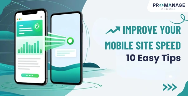
Improve Your Mobile Site Speed: 10 Easy Tips (With Examples)
These days, more people use their phones to browse the internet than computers. In fact, around 60% of global web traffic now comes from mobile devices. If your website takes too long to load on a phone, people won’t wait—they’ll just leave.
That’s why having a fast-loading mobile site is no longer optional—it’s a must. A slow site means lost visitors, lower Google rankings, and fewer sales.
But don’t worry. You don’t need to be a tech expert to speed up your site. Below are 10 simple tips to help you improve your mobile website speed.
Key Benefits of Speeding Up Your Mobile Site
| Benefit | What It Means |
| Better user experience | Visitors stay longer and interact more |
| Higher search rankings | Google prefers fast-loading sites |
| More conversions | Faster sites lead to more signups, sales, or contacts |
| Lower bounce rates | People won’t leave your site before it loads |
| Improved brand image | A smooth site makes you look professional and reliable |
What Is Mobile Site Speed?
Mobile site speed means how fast your website loads and works on a smartphone or tablet. This includes:
- How fast does the main content appear
- How long does it take for buttons or forms to respond
- Whether the layout stays stable or things jump around
Why Does It Matter?
If your site takes more than 3 seconds to load, most people will leave. Also, Google uses site speed as a ranking factor. That means slow sites might not show up high in search results.
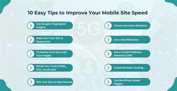
Tip 1: Use Google’s PageSpeed Insights
PageSpeed Insights is a free tool from Google that tells you what’s slowing down your mobile site—and how to fix it.
How to Use It:
- Go to the website.
- Enter your website address.
- Click Analyze.
- Switch to the Mobile tab.
Key Metrics:
| Metric | What It Checks |
| LCP (Largest Contentful Paint) | Time to load the main part of the page |
| INP (Interaction to Next Paint) | The time it takes for buttons and elements to respond |
| CLS (Cumulative Layout Shift) | Checks if anything moves around while loading |
Start by fixing the issues marked in red—these usually have the biggest impact.
Tip 2: Make Sure Your Site Is Responsive
A responsive website adjusts itself to fit different screen sizes, like phones and tablets. This makes your site look and work better on mobile.
Must-Have Features:
- Easy-to-read fonts (12–16 pt)
- Big, thumb-friendly buttons
- Images that resize automatically
- Hamburger menu for navigation
- No horizontal scrolling
Example:
Fashion site ASOS simplifies its complex desktop layout on mobile, keeping only the most important features for fast loading and easy navigation.
If you use a website builder like WordPress, Wix, or Webflow, your theme is probably responsive, but it’s still good to double-check.
Tip 3: Compress and Lazy-Load Your Images
Large image files are one of the top reasons websites load slowly on mobile.
Here’s What to Do:
- Compress images using free tools like TinyPNG before uploading.
- Use WebP or SVG formats—they’re smaller than JPEG or PNG.
- Set image width to 100% so they scale properly.
- Use lazy loading, which means images load only when users scroll down.
Lazy Loading Tip:
If you use WordPress, you can enable this using a plugin or simply add loading=”lazy” in the image code.
Tip 4: Minify Your Code (HTML, CSS, JavaScript)
Minifying means cleaning up the extra spaces, comments, and line breaks in your code files so they load faster.
Example:
Before Minifying:
css
CopyEdit
body {
font-family: Arial;
color: #333;
}
After Minifying:
css
CopyEdit
body{font-family:Arial;color:#333}
Tools to Help:
- Autoptimize (WordPress)
- Minify-All
- CDNs like Cloudflare (some offer auto-minify options)
Tip 5: Test Your Site on Real Devices
Even if your site looks good on your phone, it might not on others. Different devices and browsers behave differently.
Use Tools Like:
- Browser Stack – It allows you to test across hundreds of phones and browsers
- Ask friends or teammates to test your site on their devices
Test things like:
- Page layout
- Font size
- Buttons and menu behavior
- Speed and interaction
Tip 6: Check Interactive Elements
Fast loading isn’t just about how quickly the page appears. It’s also about how well users can interact with the page.
Common Elements to Test:
- Hamburger menus
- Read more/load more buttons
- Slide-out sidebars
- Forms and success messages
- Popups and accordions (expandable sections)
Make sure these elements are responsive and fast. Also, avoid full-screen popups on mobile—they often annoy users and hurt your speed score.
Tip 7: Use a Fast Web Host
Your hosting company plays a big role in your site’s speed. If their servers are slow, your site will be too.
Choose Hosting That’s:
- Not shared (shared hosting = many sites on one server = slower speeds)
- VPS or cloud-based, which gives better performance
- Scalable, so you can handle traffic spikes
- Known for good uptime and customer support
Tip 8: Use a Content Delivery Network (CDN)
A CDN stores copies of your website on servers around the world. This helps people access your site faster, no matter where they are.
Top CDNs to Try:
| CDN Name | Best For |
| Cloudflare | Easy setup for WordPress |
| Amazon CloudFront | High-traffic websites |
| Google Cloud CDN | Strong global coverage |
| Fastly | Great for E-Commerce sites |
Most CDNs offer a free plan or trial. They’re especially helpful if you have global visitors.
Tip 9: Enable Browser Caching
Browser caching tells your visitors’ browsers to save a copy of your site’s content. So, when they visit again, it loads much faster.
How to Set It Up:
- Use plugins like WP Super Cache (WordPress)
- Enable caching in your website builder settings
- For advanced users, adjust your .htaccess file
Most CDNs offer a free plan or trial. They’re especially helpful if you have global visitors.
Tip 10: Use WordPress Speed Plugins
If you use WordPress, you can improve your mobile site speed with plugins—no coding needed!
Best Plugins:
| Plugin | What It Does |
| WP Rocket | All-in-one speed booster (best option overall) |
| W3 Total Cache | Improves caching and performance |
| Autoptimize | Minifies code and scripts |
| Imagify | Compresses images (lazy load plugin also available) |
| Perfmatters | Turns off unused features and scripts |
Start with WP Rocket if you’re only using one—it covers most tasks in one place.
Final Thoughts: Focus on Mobile
Many website owners optimize only for desktop and forget about mobile. But today, most visitors come from mobile devices, and their expectations are high.
Here’s a quick recap:
| Do This | Why It Helps |
| Use PageSpeed Insights | Spot and fix slow-loading parts of your site |
| Make your site responsive | Looks great and works on all screen sizes |
| Compress and lazy-load images | Big files don’t slow your site down |
| Minify your code | Cleaner files = faster loading |
| Test on multiple devices | Fix design or speed issues for all users |
| Optimize interactive elements | Make your site more user-friendly |
| Choose a good host | Faster servers = faster website |
| Add a CDN | Speed up access for global visitors |
| Enable caching | Faster load times for repeat visitors |
| Use WordPress speed plugins | Easy fixes, no need for coding |
Final Tip:
Mobile site speed affects your traffic, your revenue, and your reputation. By applying the tips above, you’ll create a faster, smoother experience that keeps visitors happy—and coming back.
Let us know if you’d like a mobile speed checklist, or we can help you create a personalized speed improvement plan!

Related Posts


SEO Team Lead
Preeti is a skilled SEO Team Lead passionate about boosting organic traffic and improving search rankings. She leads with data-driven strategies to help businesses grow online effectively.