10 Landing Pages That Will Get You More Sales

Your landing page is often the most important part of your digital marketing because it tells you if visitors will become paying buyers. Your ROI will go down even if you have the best ads in the world if your landing page doesn’t convert. There are some things that all high-converting landing pages have in common: they are simple, clear, trustworthy, and designed to lead users to take a clear action.
This guide will talk about 10 types of landing pages that always get results, and you’ll learn things that you can use in your own business.
1. Free trial pages for SaaS
For software companies, the page with the free sample is often the best place to get people to buy. It works so well because it makes it easier for people to join. People who use the product get to try it out before they have to pay for it. The best SaaS free trial pages show the instant benefit, give a quick look at how the software works, and make the sign-up form as simple as possible.
A catchy headline that promises to solve a specific problem quickly, like “Automate your invoices in 10 minutes,” makes the trial seem like a good idea right away. Short demo movies or GIFs that show how the product works can help people who are thinking about buying it picture themselves succeeding. Your conversion rate will go up if you cut down on the steps between a visitor and their first win.
2. E-commerce landing pages (single product)
Online stores selling a hero product benefit from a targeted landing page over a chaotic storefront. Block off all other ideas and focus on why this thing is worth buying. Big, detailed photographs or real-life shots of individuals using the product help customers visualize using it. The copy should explain what makes it special, whether it’s expertise, materials, or that it works better than anything else on the market.
Trust from others is crucial. Written evaluations with photographs, star ratings, and short videos make customers more likely to click “Add to Cart”. Some brands create a timeline of ownership feelings after one day, week, and month. This helps people set achievable goals and gain confidence.
3. Webinar and Live Workshop Registration Pages
Webinars are great for getting new leads, but only if people sign up and show up. The starting page for a webinar needs to make it clear why people should go. A page that does well might say something like, “Learn how to cut your ad spend by 27% in 30 days” instead of “Join our marketing webinar.” I like that this is clear, measured, and appealing.
On the best webinar pages, there is also a professional headshot and a short statement about the host’s trustworthiness. A list of what people will learn makes things clear and builds trust. Some pages add calendar or SMS notes right at the sign-up step to get more people to show up. This small detail can have a big effect on how many people who register actually take part.
4. Pages with lead magnets
Lead magnets, like free checklists, templates, or calculators, are meant to get interested leads to give you their email addresses. When it comes to lead magnet landing pages, the best ones give worth right away. They don’t say “Download our guide,” but rather “Steal the exact template we used to save $12,000 in monthly costs.” Visual examples, like showing a few pages from the resource, help show that the offer is good. The form should only require a first name and email address to attract many signups. Having the download link on the confirmation page keeps visitors satisfied and encourages them to read your follow-up emails.
5. Home pages for local services
Your landing page should generate trust and make contact easy. This applies to doctors, home improvement experts, and lawyers. Many high-converting local business pages feature professional certificates, accolades, or years of expertise at the top. Pictures of the real staff, workplace, and vehicles humanize the company and set it apart from impersonal competitors.
A clear call to action, like “Call now,” “Book a free consultation,” or “Request a same-day estimate,” should appear multiple times without overwhelming the user. A clear three-step procedure instructs visitors what to do after contacting the business on some of the greatest local landing sites. This eliminates doubt and builds trust.
6. Mobile Apps Download Pages
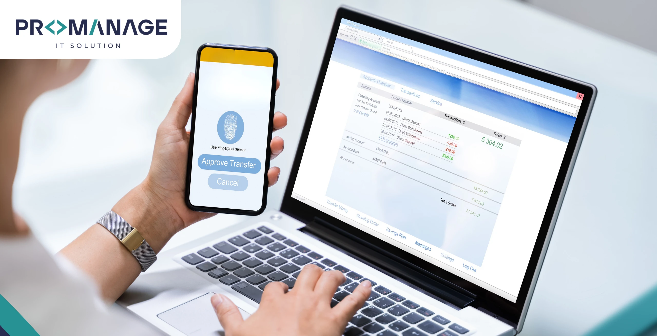
When it comes to apps, the download page’s job is simple: get people to install. Still, not every file page is the same. The ones that get the most conversions make the app’s main benefit very clear right away. Feelings are more important than functions. For example, “Wake up rested every morning” for a sleep app. Again, social proof is important, and ratings, review excerpts, and user numbers are often shown in a big way. A short movie or animated demo of the app’s interface can show how easy and fun it is to use. People are becoming more concerned about privacy, so pages that make their data policies clear tend to get more trust and more installs.
7. Pages for B2B demo requests
The landing page for business or expensive software sales needs to do more than just collect leads information; it needs to make sure the leads are good enough to buy. The best demo pages show specific ROI results and indicate that the solution is made for a certain type of business. A case study or two with measured results, like “Reduced churn by 31% in 90 days,” can reassure people who make decisions that the product really does what it says it does. The form should work with a calendar tool so the buyer can book a time right away, without having to wait for a salesperson to get back to them. This keeps people from dropping out and makes the process seem smooth.
8. Pages with prices and plans
Pricing pages are generally the last stop before a transaction, so they should be simple. Working pages present alternatives in a way that makes selection easy. The most popular concept is sometimes visually highlighted to assist find it. Using labels like “Starter,” “Growth,” and “Enterprise” instead of “Basic” or “Premium” helps people identify the suitable one quicker. A brief FAQ below the price table can answer billing, refund, and limit questions without leaving the page. A well-designed price page answers queries and gently directs consumers to the optimal value-benefit plan.
9. Home pages for events and conferences
Event entry pages should excite and rush people. People should feel compelled to attend. Strong headlines like “Two days to master AI tools, only 300 seats left!” are popular on clickbait event pages. The target audience, keynote speakers, and schedule preview assist demonstrate value. The clear time limit and ticket pricing make things more important and valuable information about the site, how you can reach there, and where do they like to live. An event organizer can give professionals a downloadable one page to help their owners celebrate tickets.
10. Donation Pages for Nonprofits
The donation page is the most significant fundraising tool for groups. Honesty and emotional storytelling are good models. Instead of making general appeals, they use one example to demonstrate how a gift can change a life. Donation levels like “$25 buys five meals,” show donors how their money is spent. Trustworthiness requires charity reports and ratings and financial transparency. Finally, a thoughtful experience according to density that thanks to the donors, tells them how their money helps, and allows them to keep in touch with long-term support and promotes a high lifetime value.
What Converts Landing Pages?
Some themes recur in all these examples.
- Every high-converting landing page has a clear aim and removes obstacles.
- Guests want to know how their lives will improve, so they focus on results rather than features.
- Word-of-mouth, pledges, and honesty build trust throughout.
- Finally, it’s easy to use. Short forms, fast page loads, and clear instructions are provided.
Landing page ROI is equally crucial. You can decide how much each page affects your lower line by tracking the conversion frequencies, customer’s procurement costs and per conversion average price. Even a minor twice, such as reducing form fields or rewriting the heading, can promote earnings in many campaigns.
Common Mistakes That Kill Conversions (and Easy Ways to Fix Them)
- Bad headline: Use outcome-first wording to fix it.
- Too many options: Hide it; one page, one goal.
- Proof that is too weak: Add names, numbers, and specific results.
- Slow loads: Delay non-essential scripts and compress media.
- Form with a leak: Add instant validation, inline mistakes, and a clear success state.
Conclusion
Landing pages listed above are not just examples. They tried and are true models that can be used in almost any business. Rules do not change if you are a mother-in-law that is trying to sign up for a free testing, sell an e-commerce store an entire product or try to receive donations. They are still the same: clarity, faith, simplicity and relevance. You can create a destination page that looks good and get the best return on the investment (ROI) by looking at these top -performing designs and using them in this way that fits your brand.








SEO Team Lead
Preeti is a skilled SEO Team Lead passionate about boosting organic traffic and improving search rankings. She leads with data-driven strategies to help businesses grow online effectively.