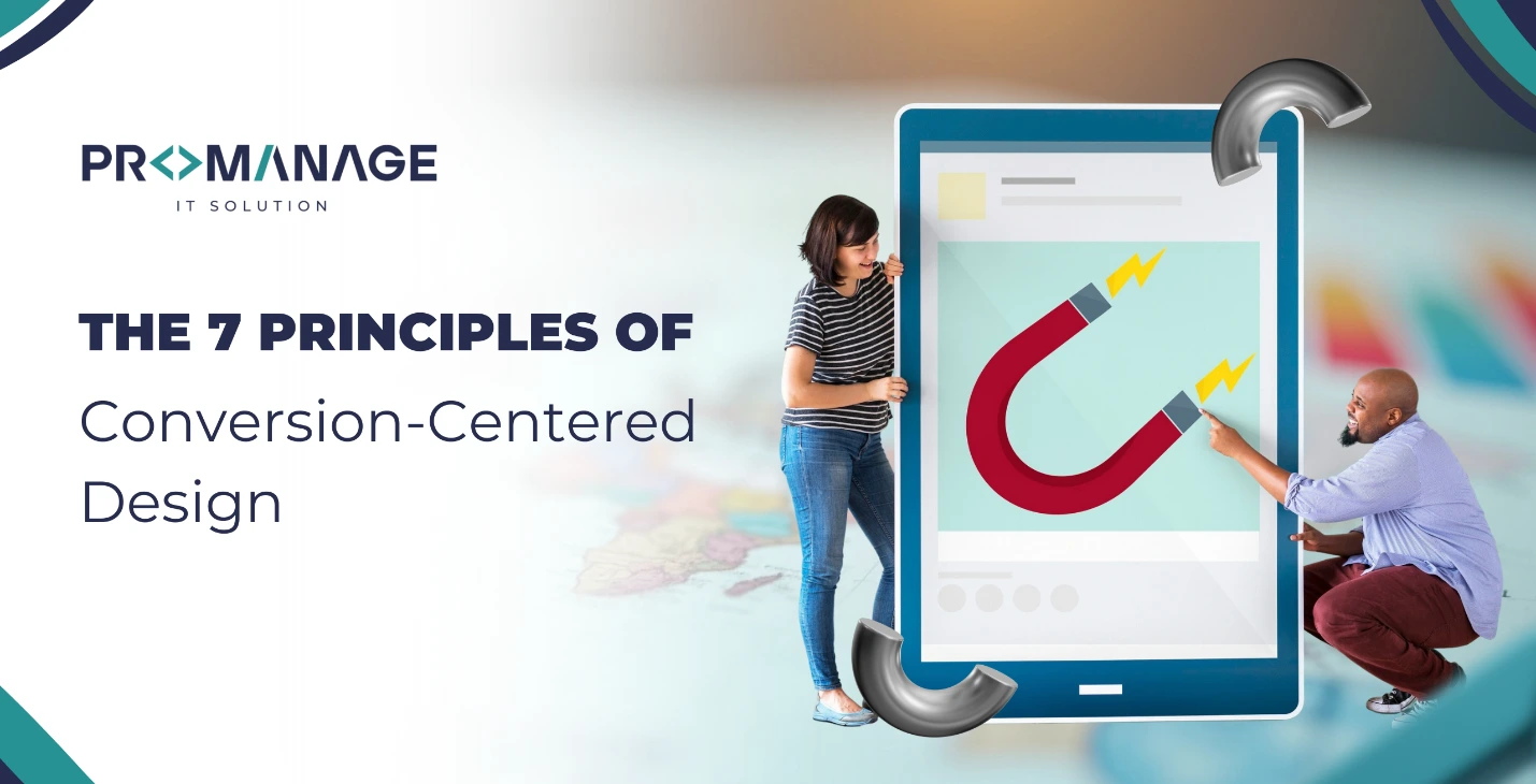
The 7 Principles of Conversion-Centered Design
Having a nice website is important, but it isn’t performing its job if it doesn’t help you convert visitors into customers. Conversion-Centered Design (CCD) is a solution for it. At ProManage IT Solution, we think that design should have a function, and conversion is that function.
This is a way of designing websites that focuses on getting people to do something, like read a white paper, sign up for a magazine, or buy something. But it’s not just about how it looks, it’s about the smart design choices that get things done that are also important.
1. Encapsulation: Use Focused Elements to Grab Attention
Encapsulation is the first Conversion Centered concept. This only requires circling your call-to-action (CTA) or most crucial content in a container that contrasts visually with the rest of the page. Encapsulation assists in focusing visitor’s attention on the precise area you need.
Suppose you want people to click on a “Start Free Trial” button. That button should be very easy to miss. To separate that area from the rest of your material, use colours, frames, and white space that are different from the rest of the page. The call to action will be the first and last thing a person sees with this type of visual style.
We help you make landing pages with clear enclosure zones at ProManage IT Solution so that your users know exactly what to do.
2. Use Colour and Contrast to Highlight Key Actions
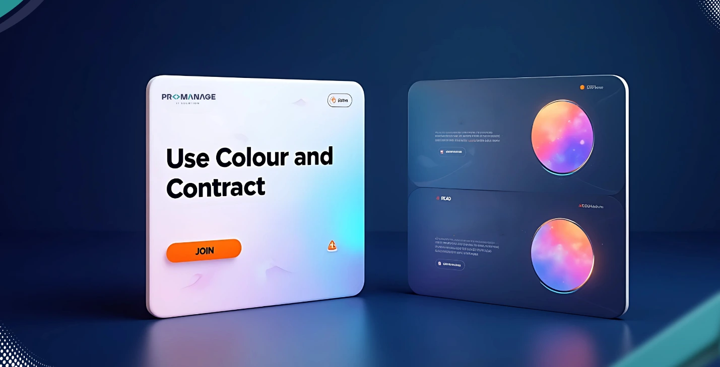
A key component of conversion-centered design is colour. It assists in establishing the tone, structuring the information, and above all, pointing out to your visitors what comes next.
Making your CTA stand out from the background and the rest of your content is the goal of using contrast successfully. This idea aids in concentrating attention where it is most needed since the human eye is naturally drawn to regions of contrast.
Depending on your overall design, your major action colour may be dazzling blue, strong red, or bright green. Whatever colour you decide on, be sure it works nicely with your backdrop and is utilised consistently throughout your website for calls to action.
3. Directional Indications: Direct the Viewer’s Gaze
Have you ever noticed how you may be drawn to something by arrows, lines, or even people staring at it? Another essential component of conversion-centered design is these, which are known as directing cues.
There are two types of directional cues: implicit (such as an image of someone staring at your form) and explicit (such as arrows pointing to a button). Without uttering a word, these visual components direct the user’s attention to your call to action.
At ProManage IT Solution, we promote the usage of these cues to create a clear and simple user experience. Users can be guided to the next step visually by even the most minor design features, such as slanted forms or shadows.
4. Whitespace: Allow Your Content to Inhale
There are instances when a page’s errors are equally as significant as its inclusions. The empty space between pieces is called whitespace, sometimes referred to as negative space. It keeps your visitors from feeling overloaded and gives your calls to action and content room to breathe.
It is difficult to focus on a page that is busy. Your main message or button will receive more attention if you leave ample whitespace surrounding it. Consider whitespace as a spotlight that draws attention to the important things.
We stress the value of simplicity when creating pages with ProManage IT Solution. Users are naturally drawn to action by clear, open design that eliminate distractions.
5. Scarcity and Urgency: Encourage with Time or Availability
Why do flash sales and deals that only last a short time work so well? Since they make people feel like they need to act quickly, they use the psychological forces of haste and shortage.
This idea is applied in Conversion-Centered Design to encourage users to make decisions more quickly. Conversion rates may be raised by including words like “Only a few spots left,” “Offer expires in 24 hours,” or a countdown timer on your landing page.
But this needs to be done in an ethical manner. Avoid inventing a sense of urgency since this might harm your reputation. Be open and sincere, and only employ these strategies when they are really necessary.
You can add a limited offer message or countdown clocks to Unounce landing pages, which gives you the tools to increase conversions in an intelligent manner with a few clicks.
6. Try Before You Buy: Use Trust Builders to Lower Risk

Users want to feel comfortable before committing. Because of this, trust components are crucial to conversion-centered design. These consist of:
- Customer testimonials from actual clients
- Trust badges (such as “SSL Protected” or “Secure Payment”)
- Reviews and star ratings
- “Used by 50,000+ marketers worldwide” is social evidence.
These components foster confidence and dispel skepticism. The possibility that someone will convert increases with their level of confidence in your company. At ProManage IT Solution, we advise positioning these trust-builders in areas that naturally attract attention or near your call to action. At just the appropriate time, they build credibility.
7. Single Conversion Objective: Concentrate on a Single, Explicit Action
Having a single, distinct objective on every page is arguably the most crucial CCD guideline. Users may become confused by too many alternatives, which can lower your conversion rate. Rather than requesting that users “Buy Now,” “Subscribe,” and “Download” simultaneously, concentrate on just one action.
Every landing page needs to be created with a specific goal in mind. Every button, phrase, picture, and headline should point consumers in the direction of that one objective.
Creating clutter free, laser-focused landing pages is simple with ProManage IT Solution’s drag-and-drop builder. To determine which style and messaging generate the most conversions, you may A/B test several iterations of your website.
Conclusion
Conversion-Centered Design isn’t about having fancy designs or styles that are hard to understand. It’s about giving your guests a clear, focused experience that leads them slowly to take action. You can make landing pages that are not only beautiful but also useful by following these seven rules: closure, contrast, directional cues, silence, urgency, trust elements, and a single goal.
We at ProManage IT Solution assist companies in implementing these ideas. Whether you’re creating a lead-generation form, a product launch page, or a unique campaign offer, our platform is made to help you optimise outcomes through improved design.

Related Posts


SEO Team Lead
Preeti is a skilled SEO Team Lead passionate about boosting organic traffic and improving search rankings. She leads with data-driven strategies to help businesses grow online effectively.